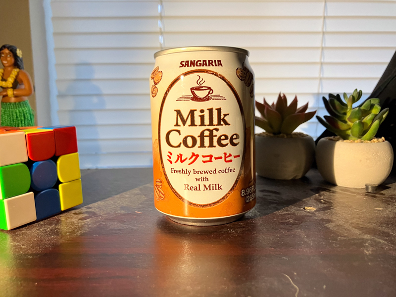
| Name | ----- | Sangaria Milk Coffee |
| Purchased From | ----- | Li Ming's |
| Nation of Origin | ----- | Japan |
| Price | ----- | $2.79 |
| Volume | ----- | 9oz 265ml |
| Cost per Ounce | ----- | ¢31 |
| Caffeine Content | ----- | N/L |
| Keywords | ----- | Bad Printing, 9 Ounce |
When I think of the brand Sangaria I think of their stubby cans of royal milk tea, which I also drank in preparation for this review. It tasted fine enough but had the aroma of creamed corn, larger cans of milk tea do it better. Why is corn such a reoccurring theme in this column? When I went to Li-Mings to buy the cans for this I found this one, a newcomer to the store. I recognized the brand and picked it up. Aside from BOSS it’s one of the most expensive cans from Li-Ming’s, 31 cents an ounce for a 9 ounce can. UCC is 20 cents less and comes in a can 2 ounces bigger with incredibly dense aluminum!
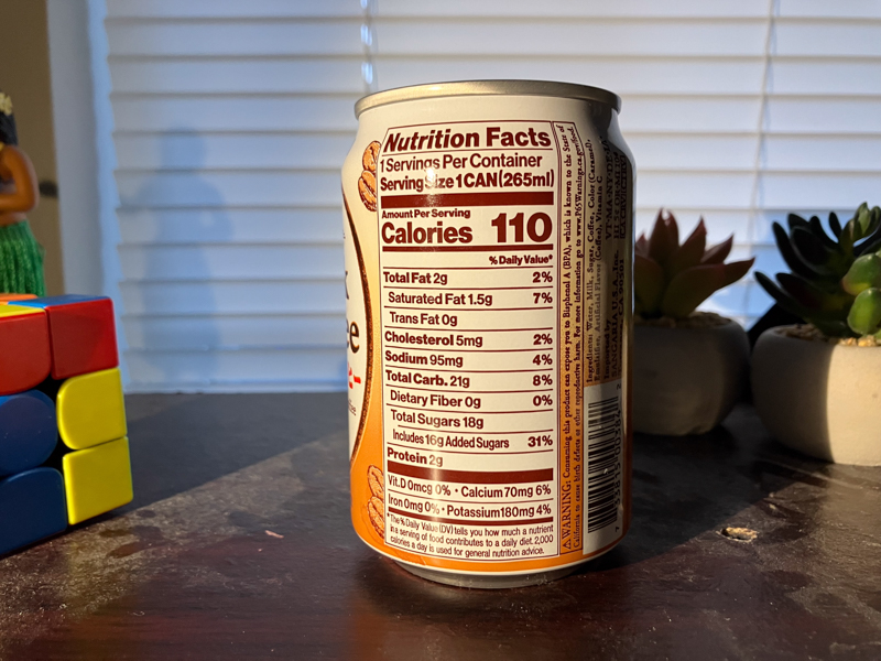
So, flavor? Well there’s no corn smell, but there is a very small flavor note of.. something. I think it’s the caramel coloring, it gives a small artificial note. Also, this is one of our coffees that has real coffee along with added coffee flavor, always a concern. It’s so faint though that I’ve gotta go looking for it. Overall the flavor is quite good, not too sweet tasting and creamy and good. They do this better than they do milk tea, certainly. Though for the higher price I would just go with pokka or highlands, or even UCC. You wanna get your moneys worth, and this tastes that good but costs more.
Ok, the reviews over and the rants beginning. Sangaria, what’s going on with your can art? I noticed the same thing on the milk tea, something in your printing process is terribly wrong. You’re printing on cans so you’re using flexography, but it’s not a problem of alignment or dirty plates or anything it’s the pressure of your plate against the substrate. Well and also alignment. Like, ok, look at this
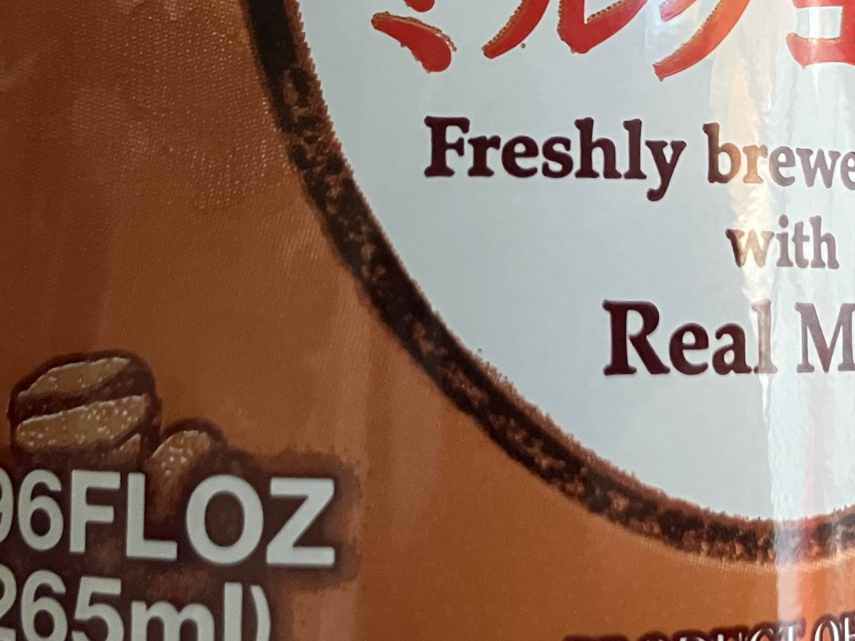
You’re using a pretty simple process for these cans. First is a white backing layer so the colors pop against the metal. Then a spot brown used for decorative elements, the nutritional facts and backing up the key text. Last is a process black and red (not a magenta yellow mix, pure red) for the “milk coffee” and red katakana. I don’t have a spectrochronomiter or light booth handy, just natural morning light and my own trained eye. Your halftone dots are clear in the clouds either side of the emblem and I respect using a less traditional 3-color process to get your desired deliverable but you can clearly see your black plate isn’t making enough contact with the can. You can see the thickness isn’t even and at parts the color didn’t make contact at all! I can understand you didn’t want to deform the metal on the smaller surfaces, but your design should accomodate the ability of your equipment. And look at this!
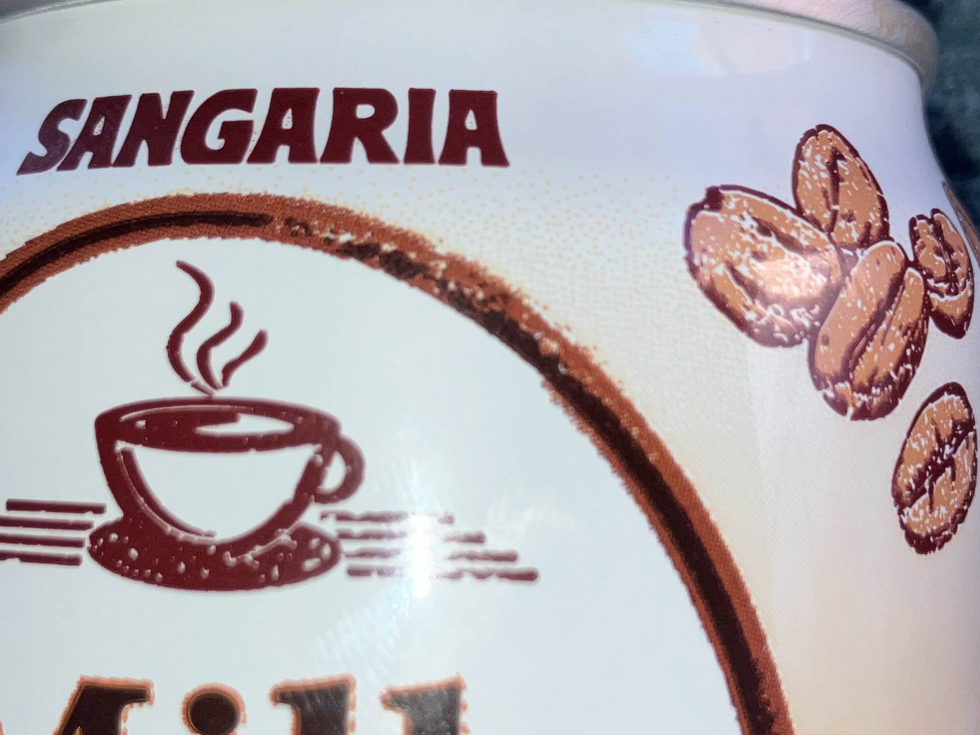
Everything here is wrong. Here both the black and brown plates are too lightly applied, you can see through to the white pass in the emblem border, cup of coffee and in the coffee beans on the side. It’s not a problem of low plate resolution, because again the cloud halftone is lovely and clear, you can see it fading out in this image.
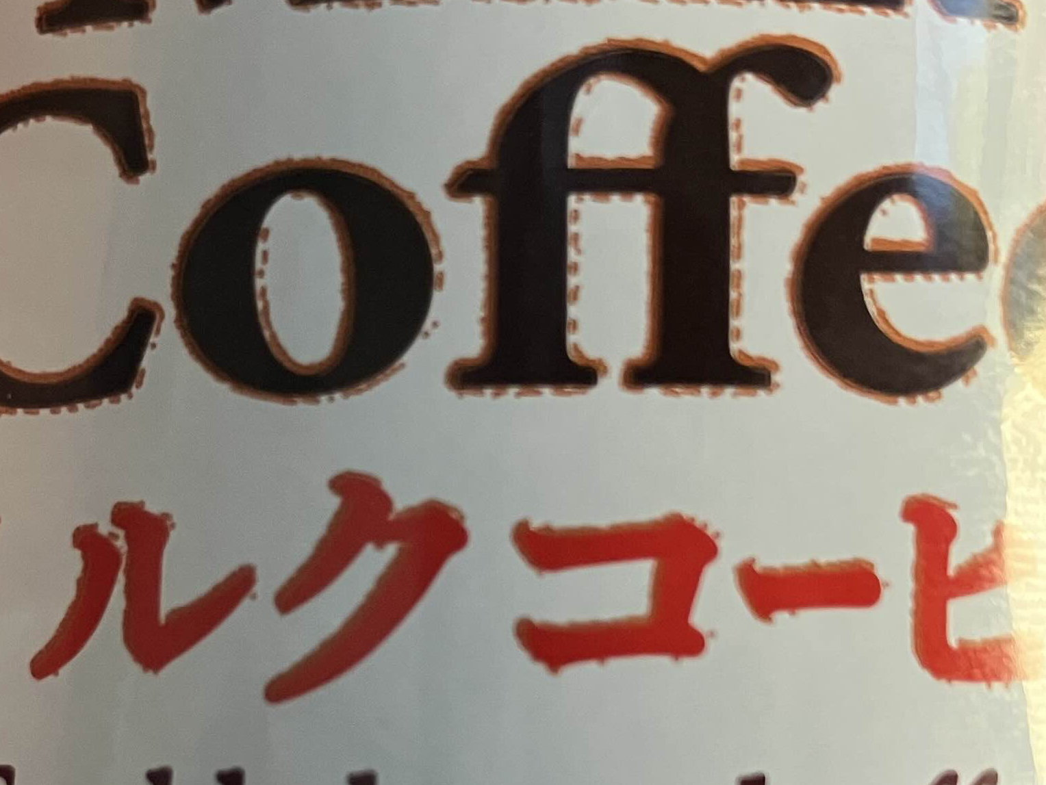
Your brown plate is too high up, you need to bring it down a millimeter or two. The ‘freshly brewed with real milk’ text is printed in the spot brown but the katakana and ‘milk coffee’ are red and black respectively, you can see the brown backing layer peeking above the characters. It’s so confusing, the nutritional facts are printed in the brown pass but are clear, likely because they aren’t halftones at all just pure color. This can and your other cans I’ve seen are a mess, this isn’t just one bad batch. Sangaria, do better. This is what industry experience gets you, kids, the right to rant over bad work.
FLAVOR SCORE-7/8
VALUE SCORE-5/8
PRINTING SCORE-2/8